

Help talk:Color templates
Winds, Waves and Champions
We Have a new generation which means we will need new colours for the new games! As such I will kick off the discussion with the following suggestions for Wind, Waves and Champions releasing soon. The colours for Winds and waves im suggesting are pulled directly from teh website and the top/bottom banner of the promotional materials (the colours match identically), while the proposal i have for Champions is based on the app icon, now available in HOME.
For Wind and Champions, these colours are quite distinct from any game we currently have, as such i really cant see any issues. For waves, we have a lot of blue games already but I feel like there is enough distinction between this proposal and what is already used. The closest colour is the Original Blue version which i have also added below as a comparative reference. I would suggest as follows:
Winds:
- Light: Option 1 - A3F4CB
- Mid: Option 1 - 71EEAF
- Dark: Option 1 - 4A9B72
Waves:
- Light: Option 1 - 609FED Blue Version - 778DE6
- Mid: Option 1 - 0A6BE4 Blue Version - 2E50D8
- Dark: Option 1 - 064694 Blue Version - 1E348C
Champions:
- Light: Option 1 - 9D8FDB Option 2 - AFA7FC
- Mid: Option 1 - 6853C7 Option 2 - 8477FB
- Dark: Option 1 - 443681 Option 2 - 564DA3
As always, the colours presented above are merely suggestions and other colour suggestions are welcomed and can be added alongside these for comparison. With that I leave it open to discussion :) 4iamking 17:04, 27 February 2026 (UTC)
- I generally like the WiWa colors, but the Winds color definitely presents readability problems with white text, and the Waves color isn't super great with black text either (although it is better than our Blue color, admittedly).
- I think the Champions color could be adjusted a bit for readability as well (don't have a strong opinion on the color itself). Landfish7 18:55, 27 February 2026 (UTC)
- is it really that big of an issue considering most of the time we're gonna use bold text on these kinda templates anyway?
- though i suppose if it's that big of a problem we can always pick a slightly darker tone from the logo, like this (#63E2A0) or like this (#59CD99). anZAsquiddles 2222(:D)SSSS (talk) 19:10, 27 February 2026 (UTC)
- Ideally the templates should work for both but thats not always possible (see gen 5 game templates as a good example), When we do display text it's usually black. That said the colour palette used for winds is quite light, even darkening it a bit from the promotional materials I dont think improves readability that much. 4iamking 19:13, 27 February 2026 (UTC)
- The current proposed Winds color isn't going to work. I'd be fine with either of anza's proposed alternatives (though I plan to do some more testing just to be sure). Landfish7 19:33, 27 February 2026 (UTC)
- Here's another possible shade: sample text (#3bdf8e). It's similar to the first shade anza gave, though a bit more vibrant and definitely more passable than the site color: sample text (#71EEAF). Landfish7 20:07, 27 February 2026 (UTC)
- The current proposed Winds color isn't going to work. I'd be fine with either of anza's proposed alternatives (though I plan to do some more testing just to be sure). Landfish7 19:33, 27 February 2026 (UTC)
Current thoughts:
- Winds seems similar to our PokePark colors we use, also some readability issues when used with white text.
- The two current options for Waves feels too dark visually.
- Champion mid also feels like it could present readability issues.
I could try double checking and presenting some other color options later today if that's alright with everyone else in the discussion so far? Frozen Fennec 20:20, 27 February 2026 (UTC)
- Go for it. Landfish7 21:07, 27 February 2026 (UTC)
- My proposed colors for Winds, Waves, and Champions
Winds:
- Light: 9CEFC4
- Mid: 66E7A4
- Dark: 42966B
Waves:
- Light: 59D2FD
- Mid: 00B9FC
- Dark: 0078A4
Champions:
- Light: AEA3E1
- Mid: 8271D1
- Dark: 554988
- Color sources: Winds (pattern on the left side of the WINDS text), Waves (Blue in the WAVES font), Champions (background color towards the center of the Champions app icon - thank you 4iamking for the source) Frozen Fennec 21:47, 27 February 2026 (UTC)
- 00B9FC looks a bit similar to our Sword color (00A1E9) , but i suppose this can't be helped in this case (there's only so many shades of blue one can use lmao).
- i don't have a problem with all the other suggestions, i like those. anZAsquiddles 2222(:D)SSSS (talk) 03:30, 28 February 2026 (UTC)
- I like Frozen Fennec's Winds suggestions. For Waves, I think using the lighter blue from the text would help make them look different from the other blues, but I guess we'd also have to do that for Winds' colorscheme as well.--ForceFire (talk) 05:46, 28 February 2026 (UTC)
- I like Fennec's Winds and Champions colour but im not a fan of the waves colour; nor do I think we should be pulling it from the text itself when we obviously won't be doing that for Winds (given the text is white). I think its better to pull from the background pattern which is a much more saturated blue (not to mention the overlap with Sword and possibly even Brilliant Diamond that that specific shade of blue creates). 4iamking 07:40, 28 February 2026 (UTC)
- I've added a second option for champions, which is pulled directly from the official website; its a bit lighter than pulling from the app icon directly and should bring better readability. 4iamking 16:13, 28 February 2026 (UTC)
- Nice! Any suggestions for the Waves color? Landfish7 17:56, 28 February 2026 (UTC)
- There isn't really anything else to pull from since it all uses the same colour; but personally I feel it should be in the theme of the banner (which is my option 1); I don't think we should deviate that far from it. Im not sure I see it as that problematic, it already has a much higher contrast ratio to black (4.93) than many of our other blue game colours, and is also quite distinct from them. (Blue, Sapphire, X, Alpha Sapphire, Ultra Moon and Indigo Disk all have worse contrast to black). 4iamking 18:13, 28 February 2026 (UTC)
- I think that's fair for now. We can always revisit some of the "older" colors down the road, if need be, but if there hasn't been complaints about them then this should probably be fine in the meantime. Landfish7 18:37, 28 February 2026 (UTC)
- From my testing, I'd say we're good to go on Frozen's Winds color and Janek's Waves (Option 1) and Champions (Option 2) color. Landfish7 18:48, 28 February 2026 (UTC)
- I've implemented them per those colours also since it's also good to get off the placeholders. If there are any tweaks that need to be made we can bring it up in this thread but I do think they work well together as it is (I like this combination). 4iamking 19:45, 28 February 2026 (UTC)
- From my testing, I'd say we're good to go on Frozen's Winds color and Janek's Waves (Option 1) and Champions (Option 2) color. Landfish7 18:48, 28 February 2026 (UTC)
- I think that's fair for now. We can always revisit some of the "older" colors down the road, if need be, but if there hasn't been complaints about them then this should probably be fine in the meantime. Landfish7 18:37, 28 February 2026 (UTC)
- There isn't really anything else to pull from since it all uses the same colour; but personally I feel it should be in the theme of the banner (which is my option 1); I don't think we should deviate that far from it. Im not sure I see it as that problematic, it already has a much higher contrast ratio to black (4.93) than many of our other blue game colours, and is also quite distinct from them. (Blue, Sapphire, X, Alpha Sapphire, Ultra Moon and Indigo Disk all have worse contrast to black). 4iamking 18:13, 28 February 2026 (UTC)
- Nice! Any suggestions for the Waves color? Landfish7 17:56, 28 February 2026 (UTC)
- I've added a second option for champions, which is pulled directly from the official website; its a bit lighter than pulling from the app icon directly and should bring better readability. 4iamking 16:13, 28 February 2026 (UTC)
- I like Fennec's Winds and Champions colour but im not a fan of the waves colour; nor do I think we should be pulling it from the text itself when we obviously won't be doing that for Winds (given the text is white). I think its better to pull from the background pattern which is a much more saturated blue (not to mention the overlap with Sword and possibly even Brilliant Diamond that that specific shade of blue creates). 4iamking 07:40, 28 February 2026 (UTC)
- I like Frozen Fennec's Winds suggestions. For Waves, I think using the lighter blue from the text would help make them look different from the other blues, but I guess we'd also have to do that for Winds' colorscheme as well.--ForceFire (talk) 05:46, 28 February 2026 (UTC)
- Color sources: Winds (pattern on the left side of the WINDS text), Waves (Blue in the WAVES font), Champions (background color towards the center of the Champions app icon - thank you 4iamking for the source) Frozen Fennec 21:47, 27 February 2026 (UTC)
Time of Day colors
With Pokopia releasing, the in-game menus gave us actual time of day colors, my current proposal are the colors below along with retiring the latenight color and color text templates, along with the color text templates of the other times of day as they don't see much if any usage. Below are the new proposed colors:
Morning:
- Light: A5DFEC A7E4E9
- Mid: 74CEE2 77D6DD
- Dark: 488693 4D8B90
Day:
- Light: A9D7FD ACD7F9
- Mid: 7BC1FC 80C2F5
- Dark: 507DA4 537E9F
Afternoon:
- Light: F0C0A7 EABBA4
- Mid: E89E77 DF9673
- Dark: 97674D 91624B
Night:
- Light: CEC2EF CEBDEC
- Mid: B3A1E7 B39AE2
- Dark: 746996 746493
These new proposed colors come from Pokopia. Frozen Fennec 02:25, 8 March 2026 (UTC)
- In general I support this. I will test the colours in a bit; but while we're at it i would also suggest we rename the "Afternoon" templates to "Evening", to better reflect how its used in (most, if not all) games. 4iamking 03:44, 8 March 2026 (UTC)
- Added the colours i've extracted from the icons, don't think there's a huge difference though. 4iamking 04:39, 8 March 2026 (UTC)
- This change has been implemented with Fennec's colours. Additionally the text colour templates as well as the unused Late Night colour have been retired, while Afternoon colour has been renamed to
{{Evening color}}. 4iamking 17:27, 6 April 2026 (UTC)- In practice I'm noticing some readability issues with these, particularly when used as colored text on a white background, such as with the sup templates, e.g. Morning. I think we could use the Pokopia colors as the light colors instead and that would work a lot better. I noticed similar issues with the season colors too, fwiw, e.g. Spring. I also think the colors would stand apart from each other better this way (I currently find the Morning and Day colors to be quite similar, but I think if they were used as light colors they might not look as close). Landfish7 11:09, 7 April 2026 (UTC)
- Imo another option is just to use the dark variant for the sup template (this is what the template used to do with morning colour). Its a very secondary use of the colour though since they are primarily used in the catch templates and our "time slider" displays on pages like Time or Shoal Cave, and for this having them lighter is preferable I feel. There really shouldn't be any other cases beyond the sup template where they are used as text colours. 4iamking 11:25, 7 April 2026 (UTC)
- I do see your point, though I don't know that the dark colors work all too well for the sups either. Landfish7 11:35, 7 April 2026 (UTC)
- Imo another option is just to use the dark variant for the sup template (this is what the template used to do with morning colour). Its a very secondary use of the colour though since they are primarily used in the catch templates and our "time slider" displays on pages like Time or Shoal Cave, and for this having them lighter is preferable I feel. There really shouldn't be any other cases beyond the sup template where they are used as text colours. 4iamking 11:25, 7 April 2026 (UTC)
- In practice I'm noticing some readability issues with these, particularly when used as colored text on a white background, such as with the sup templates, e.g. Morning. I think we could use the Pokopia colors as the light colors instead and that would work a lot better. I noticed similar issues with the season colors too, fwiw, e.g. Spring. I also think the colors would stand apart from each other better this way (I currently find the Morning and Day colors to be quite similar, but I think if they were used as light colors they might not look as close). Landfish7 11:09, 7 April 2026 (UTC)
- This change has been implemented with Fennec's colours. Additionally the text colour templates as well as the unused Late Night colour have been retired, while Afternoon colour has been renamed to
- Added the colours i've extracted from the icons, don't think there's a huge difference though. 4iamking 04:39, 8 March 2026 (UTC)
Colour schemes for Gigantamax and Mega Evolutions?
The upcoming Pokédex book gives us a pretty distinctive colour scheme for both Mega Evolution and Gigantamax Pokémon. Adopting it would give us the following colour scheme:
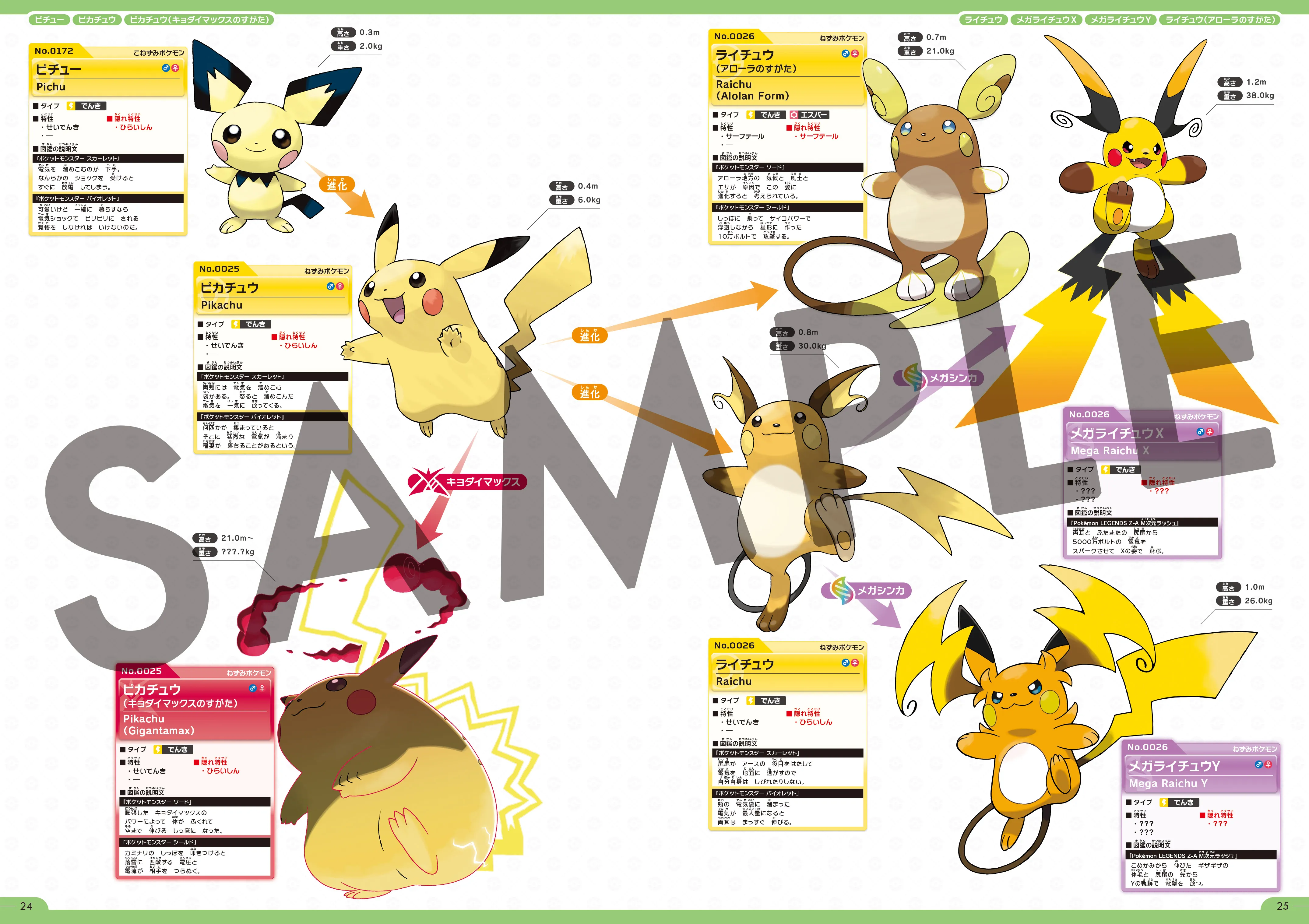
Mega:
- Mega color light:
CFA7CC - Mega color:
B577B1 - Mega color dark:
764D73
Giga:
- Giga color light:
E55D86 - Giga color:
D70645 - Giga color dark:
8C042D
These colours are somewhat similar to our Mega Dimension and Shield colours respectively but still quite distinct from them. The question is should we formalize them? 4iamking 16:13, 15 May 2026 (UTC)
- Where would they be used? Oneofthosedf (talk) (contribs) 16:24, 15 May 2026 (UTC)
- My feeling is primarily in the nav templates; but they could also be useful to differentiate such forms in the species page by using them as a background in the Evolution background and also in the side game data; as well as pages like Gigantamax (GO). its also worth noting that this kinda also inverts the colours we currently use since we primarily use the Kalos/Galar colours which are red and purple respectively. 4iamking 16:35, 15 May 2026 (UTC)
- Alright, nice. Oneofthosedf (talk) (contribs) 17:25, 15 May 2026 (UTC)
- My feeling is primarily in the nav templates; but they could also be useful to differentiate such forms in the species page by using them as a background in the Evolution background and also in the side game data; as well as pages like Gigantamax (GO). its also worth noting that this kinda also inverts the colours we currently use since we primarily use the Kalos/Galar colours which are red and purple respectively. 4iamking 16:35, 15 May 2026 (UTC)
- Where would they be used? Oneofthosedf (talk) (contribs) 16:24, 15 May 2026 (UTC)
- i would love these for the nav templates. i'm not currently satisfied with how the Gigantamax nav template looks at the moment. Chaogotchi (talk) 22:13, 15 May 2026 (UTC)
- Yeah it could use some remodeling to look nicer like mega evolution template. Jacob9594 (talk) 22:23, 15 May 2026 (UTC)
- Would the "Gigantamax color" just be used for Gigantamax forms or could it be used for Dynamax as well? Thinking that it might be useful in the party Pokémon template as the color for Max Moves. Storm Aurora (talk) 17:17, 16 May 2026 (UTC)
- How about both since is the same gimmick? Jacob9594 (talk) 17:33, 16 May 2026 (UTC)
- Would the "Gigantamax color" just be used for Gigantamax forms or could it be used for Dynamax as well? Thinking that it might be useful in the party Pokémon template as the color for Max Moves. Storm Aurora (talk) 17:17, 16 May 2026 (UTC)
- Yeah it could use some remodeling to look nicer like mega evolution template. Jacob9594 (talk) 22:23, 15 May 2026 (UTC)
New color scheme for shadow
This is for Shadow Pokémon, not for the shadow location.
I would like to introduce a standalone shadow color to help differentiate trainers in Gen 3 Colosseum and XD: Gale of Darkness that do and do not have Shadow Pokémon in their party. This could also prove useful for Pokémon GO pages about Shadow Pokémon. I realize the reach of this color scheme would be limited, but it would be extremely useful for XD: Gale of Darkness-related pages. In Colosseum-related pages, the {{shadow}}tag works well, but it redirects to {{xd}}, which means on trainer cards using the xd scheme, you cannot tell, at a glance, visually if a trainer has a Shadow Pokémon. You need to manually check their party.
My full proposal with comparison visuals can be found here: User:Jusblazm/colortemplates.
Here is my proposed color scheme
Colors
- Shadow Color Light: 9180D9
- Shadow Color: 4A2E88
- Shadow Color Dark: 181224
This is part of my initiative to touch up and complete both the Pokémon Colosseum Walkthrough and the Pokémon XD: Gale of Darkness Walkthrough. If this color scheme is accepted, the Colosseum walkthrough will retroactively update, as all trainers with Shadow Pokémon are currently using the {{shadow}} tag. When I move on to the XD walkthrough, I will be ensuring all trainers with Shadow Pokémon are also using the {{shadow}} tag.
I have already created the template pages for {{shadow color light}}, {{shadow color}}, and {{shadow color dark}}, which are sitting on my local machine, but I would like approval before creating them here. Jusblazm (talk) 19:51, 17 July 2026 (UTC)
- Comment: Not taking any position on this but but only noting that if it were to go through our formula would dictate that the light colour would be
#8977B2, while the dark colour would be#301E58(using your suggested midtone). 4iamking 13:47, 19 July 2026 (UTC)- is there a place I can see the formula so I can better design the colors? I didn't spot any sort of formula when I was proposing this originally, and the light from this midtone formula is nearly identical to the xd midtone, which wouldn't work. I would like to try and find a new suiting color. Jusblazm (talk) 19:57, 19 July 2026 (UTC)
- There isn't really I have an Excel sheet to do this but all we really do is we shift the colour 35% lighter/darker to get the light/dark colours respectively. so you can take the mid colour and multiply it by 0.65 to get the dark colour; while for the light colour you'd have to do ((255-(mid colour hex))*0.35)+(mid colour hex) 4iamking 21:01, 19 July 2026 (UTC)
- thank you so much. I'll look into a new set of colors that would work while still looking easily distinguishable. Jusblazm (talk) 21:04, 19 July 2026 (UTC)
- There isn't really I have an Excel sheet to do this but all we really do is we shift the colour 35% lighter/darker to get the light/dark colours respectively. so you can take the mid colour and multiply it by 0.65 to get the dark colour; while for the light colour you'd have to do ((255-(mid colour hex))*0.35)+(mid colour hex) 4iamking 21:01, 19 July 2026 (UTC)
- is there a place I can see the formula so I can better design the colors? I didn't spot any sort of formula when I was proposing this originally, and the light from this midtone formula is nearly identical to the xd midtone, which wouldn't work. I would like to try and find a new suiting color. Jusblazm (talk) 19:57, 19 July 2026 (UTC)