User:Tiddlywinks/MakeHideButton
class="clicktoggle clicktoggle-active" data-type="set" data-for="Spoilers,DLC" style="; " data-active-style="; "
Template documentation
|
|---|
| Note: portions of the template sample may not be visible without values provided. |
| View or edit this documentation. (About template documentation) |
Adding this template to an element turns it into a button that hides targets that have the same values (see User:Tiddlywinks/MakeHideTarget).
Overall, when this button is clicked "on", it searches the page for matching targets (same group) and acts on them (generally it shows/toggles those with the same name, with some nuances depending on type); at the same time, when the button is turned on, an "on" style is applied, and when it is turned off, a default/"off" style is (re)applied. I.e., targets only show/hide, but buttons can apply different styles when they're "on" or "off".
The ClickToggle function this code is based on is courtesy of de:User:Buoysel.
Parameters
- Unnamed
- 1: a "group" name
- 2: a name designating a specific thing in the current group (generally whatever is in the element this is attached to)
- Named
- type (optional):
setortoggle(defaults toset): defines what happens to targets when the button is pressed...- set: affects targets in the same group (parameter 1): all targets with the same name (parameter 2) are shown ("display: none" is removed), all other targets are hidden ("display: none" is added)
- toggle: affects targets in the same group (parameter 1): the visibility of all targets with the same name (parameter 2) is toggled (if they were visible, "display: none" is added, otherwise, it is removed)
- start (optional):
onoroff(defaults toon): whether the button should start with its on or off style (ideally, this should match the state of the target, but that is not required; a mistake will only produce a moment of unexpected behavior for the first click) - common (optional): a common style to apply regardless of whether the button is active or inactive (such as
background-color: #FFF; width: fit-content; ...; quotation marks and "style=" are not needed, those are handled by the template) - on (optional): a style to apply when the button is activated
- off (optional): a style to apply when the button is deactivated
If this template will be used within another template, it may be smart to "seed" the group name (parameter 1) with a random number. Something like the current date/time or the wiki's latest revision are decent options. This will prevent collisions in case someone might try to use the same value elsewhere on the page, which may cause issues and be hard to track down (if one is hidden in a template).
Note that the common/on/off parameters are setting values for the element's style attribute, so that should not be set outside of this template. If you wish to set the element's style (and it is unrelated to the on/off state of the button), it should be included in the common parameter.
Examples
While the examples below will mainly show targets that are visible by default, it's not hard to make them hidden by default. There are some "dangers" to this, but for more details, see #Hide by default.
Type: set
The set type makes it so that only one kind of target within a group is shown at a time. (This may not necessarily be true in the initial state, as below (which can be fixed), but it will be once you click any "set" buttons.)
Note that "set" buttons do not have a different behavior if you click them when they are already "on". These buttons purely show the designated target, they do not hide it; targets are only hidden when another button is selected. (If you really want to re-hide a visible target without having to select (show) a different target, you can add a toggle button with the same group/name.)
<div
{{User:Tiddlywinks/MakeHideButton|SetHideMons|bulb|start=off
|common=text-align: center; border: 1px solid #000; width: 128px;
|off=background-color: white
| on=background-color: green
}}>Choose Bulb</div>
<div
{{User:Tiddlywinks/MakeHideButton|SetHideMons|char|start=off
|common=text-align: center; border: 1px solid #000; width: 128px;
|off=background-color: white
| on=background-color: orange
}}>Choose Char</div>
<div
{{User:Tiddlywinks/MakeHideButton|SetHideMons|squirt|start=off
|common=text-align: center; border: 1px solid #000; width: 128px;
|off=background-color: white
| on=background-color: blue
}}>Choose Squirt</div>
<div {{User:Tiddlywinks/MakeHideTarget|SetHideMons|bulb}} style="width: fit-content; background-color: green;">
See me!
[[File:0001Bulbasaur.png|100px]]
</div>
<div {{User:Tiddlywinks/MakeHideTarget|SetHideMons|char}} style="width: fit-content; background-color: orange;">
See me!
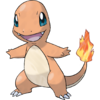
[[File:0004Charmander.png|100px]]
</div>
<div {{User:Tiddlywinks/MakeHideTarget|SetHideMons|squirt}} style="width: fit-content; background-color: blue;">
See me!
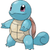
[[File:0007Squirtle.png|100px]]
</div>
<div>''I'm not hidden.''</div>
Type: toggle
Toggle can be used a number of ways.
Basic
In its most generic function, toggle will turn individual targets in a group on and off (generally like separate light switches). In this way, "group" arguably doesn't matter for the toggle type. If the only thing on a page is toggle buttons/targets, then they can all be the same group—unless you really want to have two targets with the same name that react separately (different groups). On the other hand, if there are "set" buttons/targets on the page, you probably want your toggle buttons/targets in their own group (unless you're aiming for some very complicated interactions). Ultimately, for toggle, it doesn't much matter if everything has different groups and names, so long as the buttons and targets you actually want linked are the same.
Note that for the toggle type, the on/off styles are fully interchangeable. The "right" style depends only on the visual message you want to relay; beyond that, the pracitcal functionality is unaffected.
(Also note that the only difference between this and the "set" example above, aside from the group names, is "|type=toggle".)
<div
{{User:Tiddlywinks/MakeHideButton|ToggleHideMons|bulb|type=toggle|start=off
|common=text-align: center; border: 1px solid #000; width: 128px;
|off=background-color: white
| on=background-color: green
}}>Toggle Bulb</div>
<div
{{User:Tiddlywinks/MakeHideButton|ToggleHideMons|char|type=toggle|start=off
|common=text-align: center; border: 1px solid #000; width: 128px;
|off=background-color: white
| on=background-color: orange
}}>Toggle Char</div>
<div
{{User:Tiddlywinks/MakeHideButton|ToggleHideMons|squirt|type=toggle|start=off
|common=text-align: center; border: 1px solid #000; width: 128px;
|off=background-color: white
| on=background-color: blue
}}>Toggle Squirt</div>
<div {{User:Tiddlywinks/MakeHideTarget|ToggleHideMons|bulb}} style="width: fit-content; background-color: green;">
Hide me!
[[File:0001Bulbasaur.png|100px]]
</div>
<div>''I'm not hidden.''</div>
<div {{User:Tiddlywinks/MakeHideTarget|ToggleHideMons|char}} style="width: fit-content; background-color: orange;">
Hide me!
[[File:0004Charmander.png|100px]]
</div>
<div>''I'm not hidden.''</div>
<div {{User:Tiddlywinks/MakeHideTarget|ToggleHideMons|squirt}} style="width: fit-content; background-color: blue;">
Hide me!
[[File:0007Squirtle.png|100px]]
</div>
<div>''I'm not hidden.''</div>
Spoiler
A slightly more abstract way to use a toggle button is just as a show/hide for a single target.
<div
{{User:Tiddlywinks/MakeHideButton|Spoiler|mew|type=toggle|start=off
|common=text-align: center; border: 1px solid #000; width: 128px;
}}>Toggle spoilers!</div>
<div {{User:Tiddlywinks/MakeHideTarget|Spoiler|mew}} style="background-color: pink;">
I'm a spoiler
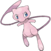
[[File:0151Mew.png|100px]]
</div>
<div>''I'm not spoilers.''</div>
Also note, this can easily be extended into a page-wide button. Using the example of "spoilers", if you want to hide all spoilers on the page, just wrap each one in a div and use User:Tiddlywinks/MakeHideTarget to make them all react to one button (or several buttons that all have the same values).
Hide by default
You can make targets start off hidden by adding display: none; to their style attribute (this is what the ClickToggle function adds/removes on targets). But this may be "dangerous". This truly makes hidden the default state for the element; if javascript fails for ClickToggle, the button won't work and the content will stay hidden, with no way to show it (without the user using advanced tools to directly edit the page's active CSS).
The example below shows a toggle button/targets where the targets start out hidden.
<div
{{User:Tiddlywinks/MakeHideButton|hideSpoilers2|SV-DLC-epilogue|type=toggle|start=off
|common=text-align: center; border: 1px solid #000; width: 128px;
|off=background-color: white
| on=background-color: orange
}}>Click me!</div>
<div {{User:Tiddlywinks/MakeHideTarget|hideSpoilers2|SV-DLC-epilogue}} style="width: fit-content; display: none; background-color: yellow;">
Hide me!
[[File:0001Bulbasaur.png|100px]]
</div>
<div>''I'm not hidden.''</div>
<div {{User:Tiddlywinks/MakeHideTarget|hideSpoilers2|SV-DLC-epilogue}} style="width: fit-content; display: none; background-color: yellow;">
Hide me!
[[File:0001Bulbasaur.png|100px]]
</div>
<div>''I'm not hidden.''</div>
Advice
Hide targets
User:Tiddlywinks/MakeHideTarget overwrites the "display" property of its element. This means if you want to hide a grid (that is using display: grid), you can't directly make the grid the target: doing so will screw up its format after the button is clicked. If you want to hide such a grid, then you have to wrap it in another element that will solely handle the show/hide functionality.
This first example shows User:Tiddlywinks/MakeHideTarget being used directly on a grid. Originally, the spoiler section shows a 2x2 group of "Spoiler" areas. If you click the button to hide and then show it again, all 4 "spoiler" areas will be stacked on top of each other instead.
<div
{{User:Tiddlywinks/MakeHideButton|TestA|pink|type=toggle|start=off
|common=text-align: center; border: 1px solid #000; width: 128px;
|on =background-color: pink
|off=background-color: white
}}>Toggle spoilers!</div>
<div {{User:Tiddlywinks/MakeHideTarget|TestA|pink}} style="display: grid; grid-template-columns: 1fr 1fr; text-align: center; background-color: pink;">
<div>Spoiler 1</div>
<div>Spoiler 2</div>
<div>Spoiler 3</div>
<div>Spoiler 4</div>
</div>
<div>''I'm not spoilers.''</div>
This example shows how to wrap the grid-styled element in a new div so that ClickToggle can safely change its display property (in contrast to above).
<div
{{User:Tiddlywinks/MakeHideButton|TestB|pink|type=toggle|start=off
|common=text-align: center; border: 1px solid #000; width: 128px;
|on =background-color: pink
|off=background-color: white
}}>Toggle spoilers!</div>
<div {{User:Tiddlywinks/MakeHideTarget|TestB|pink}}>
<div style="display: grid; grid-template-columns: 1fr 1fr; text-align: center; background-color: pink;">
<div>Spoiler 1</div>
<div>Spoiler 2</div>
<div>Spoiler 3</div>
<div>Spoiler 4</div>
</div>
</div>
<div>''I'm not spoilers.''</div>
Mistakes
As mentioned in #Parameters, you shouldn't try to set the button's style outside of the common/on/off parameters. Doing so can result in unexpected behavior.
This is a toggle that is correctly set to turn pink when it is on.
<div
{{User:Tiddlywinks/MakeHideButton|Test1|mew|type=toggle|start=off
|common=text-align: center; border: 1px solid #000; width: 128px;
|on =background-color: pink
|off=background-color: white
}}>Toggle spoilers!</div>
<div {{User:Tiddlywinks/MakeHideTarget|Test1|mew}} style="background-color: pink;">
I'm a spoiler
[[File:0151Mew.png|100px]]
</div>
<div>''I'm not spoilers.''</div>
If you attempt to set a style before the template call, then the template will override it completely and it will have no effect. (In other words, this functions the same as the "correct" one above. But if you were counting on "color: blue", you're out of luck.)
(The differing lines between the first, "correct" version and this version are highlighted here.)
<div
{{User:Tiddlywinks/MakeHideButton|Test2|mew|type=toggle|start=off

<div style="color: blue;"
{{User:Tiddlywinks/MakeHideButton|Test2|mew|type=toggle|start=off
If you attempt to set a style after the template call, then the off style (as well as the common component that would supplement it) will be overwritten; the new style effectively becomes the off style (making the font blue here).
(The differing lines between the first, "correct" version and this version are highlighted here.)
|off=background-color: white
}}>Toggle spoilers!</div>

|off=background-color: white
}} style="color: blue;">Toggle spoilers!</div>


