Template:ColorCollapseBox/doc
ColorCollapseBx is a customisable box that includes a colored title bar and a separate collapsible content area. It if often used in combination with {{ContentGrid}}.
How to use
Parameters
All parameters are case sensitive.
| Parameter | Allowed values | Notes |
|---|---|---|
t-background
|
List of colors » | Sets the background color of the title bar. If using a color template, use the whole name, e.g. {{Emerald color}}. Don't include #. Defaults to {{bulba color light}}.
|
t-background2
|
List of colors » | Optional. Allows for a second title bar color. If using a color template, use the whole name, e.g. {{Emerald color}}. Don't include #.
|
t-color
|
List of colors » | Sets the title bar text color. Don't include #. Defaults to 000.
|
t-align
|
left • right • center • justify
|
Sets the alignment of the tile in the title bar. Defaults to center.
|
icon
|
File name | Optional. Allows for an icon to be displayed in the title bar. Don't include File:.
|
icon-size
|
String | Sets the size of the icon. Must include px. Defaults to 20px.
|
icon-link
|
Link | The target destination when clicking the icon. |
icon2
|
File name | Optional. Allows for a second icon to be displayed in the title bar. Don't include File:.
|
icon2-size
|
String | Sets the size of the second icon. Must include px. Defaults to 20px.
|
icon2-link
|
Link | The target destination when clicking the second icon. |
title
|
String | The title to be displayed on the title bar. |
collapsed
|
yes
|
Whether the box should be collapsed on page load. If the box should be pre-expanded, don't include this parameter. |
toggle-background
|
List of colors » | The background color to appear behind the collapse toggle link. Defaults to match t-background. Don't include #.
|
margin
|
String | The margin around the box. Defaults to 0.5em 0.5em 1em 0.5em.
|
c-background
|
List of colors » | Sets the background color of the content area. If using a color template, use the whole name, e.g. {{Emerald color}}. Don't include #. Defaults to FFF.
|
c-color
|
List of colors » | Sets the content area text color. Don't include #. Defaults to 000.
|
c-align
|
left • right • center • justify
|
Sets the alignment of the text in the content area. Defaults to left.
|
c-pad
|
String | The padding around the content. Defaults to 0.5em 1em 0.5em 1em.
|
content
|
String | The content to be displayed in the content area. |
Examples
Example 1
{{ColorCollapseBox
| t-background = CCC
| icon = Bulbagarden Archives bulb.png
| title = {{color2|000|a:Main Page|Bulbagarden Archives}}
| content = <nowiki/>
* [[a:Archives:FAQ|FAQ]]
* [[a:Help:Uploading images|Uploading images]]
* [[a:Archives:Tagging images|Tagging images]]
* [[a:Archives:Manual of style|Manual of style]]
}}
Example 2
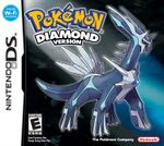
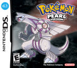
{{ColorCollapseBox
| t-background = {{diamond color}}
| t-background2 = {{pearl color}}
| c-align = center
| collapsed = yes
| title = {{color2|FFF|Walkthrough:Pokémon Diamond and Pearl|Pokémon Diamond & Pearl}}
| content = [[File:Diamond EN boxart.jpg|150px|border|link=Walkthrough:Pokémon Diamond and Pearl]] [[File:Pearl EN boxart.jpg|150px|border|link=Walkthrough:Pokémon Diamond and Pearl]]
}}
TemplateData
ColorCollapseBox is a customisable box that includes a colored title bar and separate collapsible content area. It if often used in combination with the ContentGrid template.
| Parameter | Description | Type | Status | |
|---|---|---|---|---|
| Title background | t-background | Sets the background color of the title bar. Either a hex value (don't include a #), or a color template.
| Line | optional |
| Title background 2 | t-background2 | Optional. Allows for a second title bar color. Either a hex value (don't include a #), or a color template.
| Line | optional |
| Title text color | t-color | Sets the title bar text color. Either a hex value (don't include a #), or a color template.
| Line | optional |
| Icon | icon | Optional. Allows for an icon to be displayed in the title bar (don't include File:).
| File | optional |
| Icon size | icon-size | Sets the size of the icon. Must include px.
| String | optional |
| Icon Link | icon-link | The link destination for the first icon | String | optional |
| Icon 2 | icon2 | Optional. Allows for a second icon to be displayed in the title bar (don't include File:). | File | optional |
| Icon 2 Size | icon2-size | Sets the size of the second icon. Must include px.
| String | optional |
| Icon 2 Link | icon2-link | The link destination for the second icon | String | optional |
| Title | title | The title to be displayed on the title bar. | Line | required |
| Collapsed? | collapsed | Should the box be collapsed on page-load? If no, don't enter anything in this parameter.
| String | suggested |
| Collapse toggle background | toggle-background | The background color to appear behind the collapse toggle. Defaults to match "Title background". Don't include "#". | String | optional |
| Margin | margin | The margin around the box.
| String | optional |
| Content background | c-background | Sets the background color of the content area. Either a hex value (don't include a #), or a color template.
| Line | optional |
| Content text color | c-color | Sets the content area text color. Either a hex value (don't include a #), or a color template.
| Line | optional |
| Content alignment | c-align | Sets the alignment of the text in the content area.
| Line | optional |
| Content padding | c-pad | The padding around the content
| String | optional |
| Content | content | The content to be displayed in the content area. | String | required |